
Art of homemaking: Color your life

One of the most effective ways to use color to transform a room is to play up its architectural features. Molding, mantels, built-in bookcases, arched doorways, wainscot, windows, and doors all offer an opportunity to add another layer of interest to colored walls.
When it comes to architectural features like windows and glass doors, color can be utilized to enhance their visual impact within a room. Windows, for instance, can be framed with contrasting or complementary hues to draw attention to their shapes and lines, creating a focal point that adds depth to the space.
Similarly, glass doors can be accented with colors that harmonize with the surrounding walls or provide a striking contrast, depending on the desired aesthetic. Should your windows or glass doors require maintenance or replacement, seeking professional services such as Glass Installation and Glass Repair in Tacoma, WA ensures that these features not only remain functional but also contribute to the overall color scheme and ambiance of the room. By strategically incorporating color into architectural elements like windows and glass doors, you can elevate the visual appeal of your space while infusing it with personality and style.
Color is the easiest and most effective way of instantly creating a mood for every room in your home.
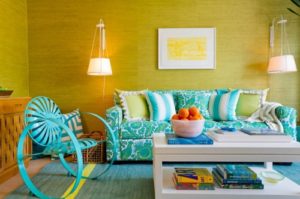
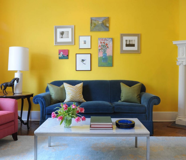
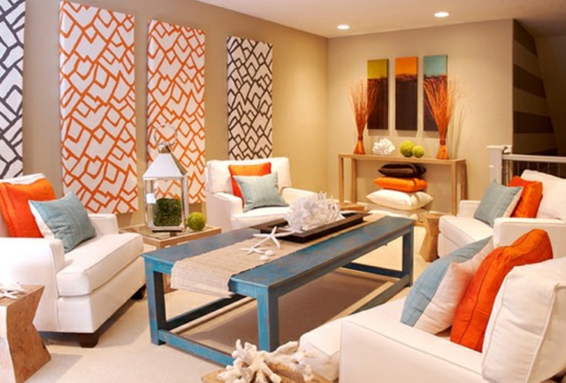
Try using warm, advancing colors in areas where you want people to feel welcomed such as living rooms, dining rooms and halls.
 You may want to make your bathroom a relaxing, stress free spa with watery colors reminiscent of the sea. Or you may want to nudge your family to get going in the morning and inject some energy with splashes of zesty acid pastels. Take your inspiration from nature.
You may want your dining room to be smart and formal for lots of corporate entertaining with navy blue or you may want a relaxed, informal feel where all the family can chill.
A chic, contemporary bedroom could be conjured from layering neutrals or create a dramatic boudoir with purples and reds.
The trick, of course, is figuring out which colors to use and where to put them.
Living room and foyer paint colors. Warm tones like reds, yellows, and oranges, and earth tones like brown and beige often work well in both the living room and foyer, because they’re though to stimulate conversation. These are colors that encourage people to sit around and talk. You feel the warmth, the connection with other people.
Kitchen paint colors. Color consultants say that if you have fond memories of spending time in the kitchen when you were a kid, it might make sense to recreate the color scheme in your grown-up kitchen. If you grew up in a blue-and-white kitchen and have great memories, blue and white may be the best colors for you and your family.
If there’s no particular paint scheme you remember fondly, reds and yellows can be great colors in the kitchen as well as in the living room and foyer. But watch out if you’re watching your weight: in addition to stimulating conversation, color consultants say that red may prompt you to eat more, if only subtly. If you’re on a diet, you might want to keep red out of the kitchen as the restaurant industry has long recognized the appetite-stimulating power of red decor.
Dining room paint colors. Because it’s stimulating, red decor can be great for a formal dining room. In addition to encouraging conversation, it whets the appetites of your guests. If your dining room is red, people may think you are a better cook, experts believe.
Bedroom paint colors. The bedroom is where you go to relax and reconnect with your partner. Cool colors — blues, greens and lavenders — can be great choices here, because they are thought to have a calming effect. The darker the hue, the more pronounced the effect is believed to be. Reds tend to increase blood pressure and heart rate and stimulate activity. Blue does just the opposite. That’s why we think of it as calming.
What if your teenager has a few ideas about how to paint his or her bedroom? In the name of family harmony, it probably makes sense to let your teen pick the paint — within reason. Harrington says she let her own daughter pick a wild paint scheme for her room — with the proviso that her daughter would repaint it white when she moved out.
Bathroom paint colors. Whites and warm colors have always been popular choices for bathrooms, in large part because they connote cleanliness and purity. But nowadays the bathroom is used not just as a place to wash up, but also as a private retreat for relaxation and rejuvenation. Most people feel comfortable with blues and greens and turquoises because these colors give a sense of being clean and fresh — and calm.
But spa colors in the bathroom make sense only if they flatter you. When you look in the bathroom mirror, you want to look great. If you would never wear a particular color, don’t paint your bathroom that color. That’s a recipe for disaster.
Workout room paint colors. Reds and oranges can help you move. But they can also make you feel hot. For this reason, blues and greens may be better choices here. Harrington says that yellow-greens and blue-greens may be the best choices because, in terms of color psychology, they’re “happier.”
Home office paint colors. The name of the game here is productivity: the faster you complete work-related tasks, the more time you’ll have to spend enjoying family and friends. And color consultants agree that green can be a great choice for a home office. Green is the color of concentration. It’s one of the best colors to be surrounded by for long periods of time.


